Exclusions Apply
*Offer valid through April 29, 2024 at 11:59 PM. O/er automatically applied at checkout; no code needed. O/er not valid on full size tiles. Free shipping will only apply to five samples, not entire order. Cannot be combined with another o/er or applied to a previous purchase. Free shipping not valid for Alaska, Hawaii, Puerto Rico, or Canada. Price shown in USD. For Canadian shipments, all taxes, duties, and brokerage fees may apply. O/er valid when shopping at FLOR.com or by calling 866.952.4094.
Try before you buy
Find a rug. Sample with swatches. Place your order. They say the best things come in threes, but we don’t mind indulging.

New & Noteworthy
Woven with eco-friendly fibers and practices, let your home blossom with our beautiful new rugs that are good for you and the planet.
Shop New
Why FLOR?
We created FLOR carpet tiles to help you design a rug without compromising your style, your lifestyle or the planet.
learn more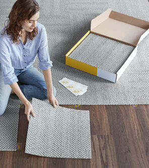
How It Works
Our sustainably manufactured carpet tiles come in squares that connect to each other with adhesive FLORdots™ to make up an area rug of any size, color, or shape.
Show Me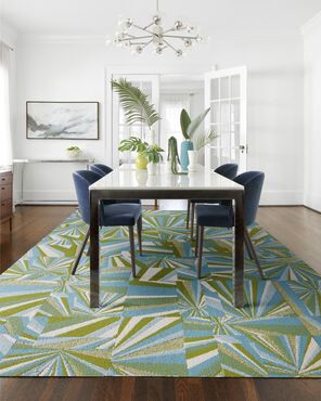
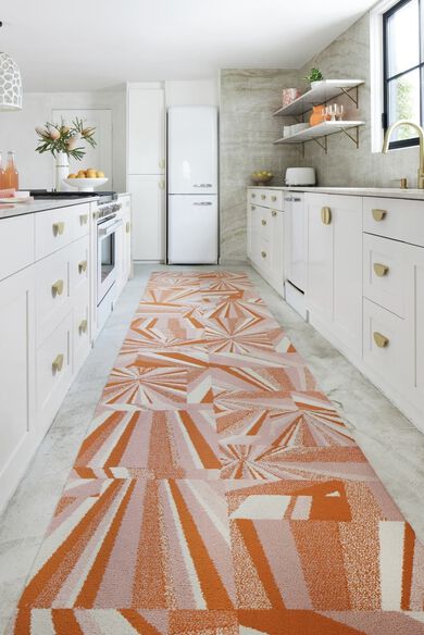
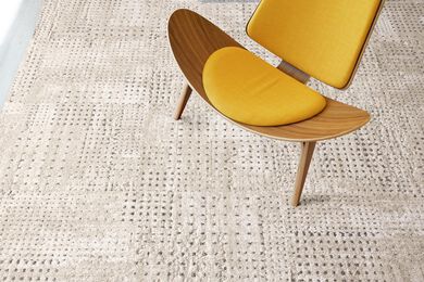
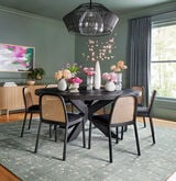
Custom Area Rugs
All available styles of FLOR carpet tiles can be combined in any way you want to create a custom rug that’s as unique as you are.
Shop Now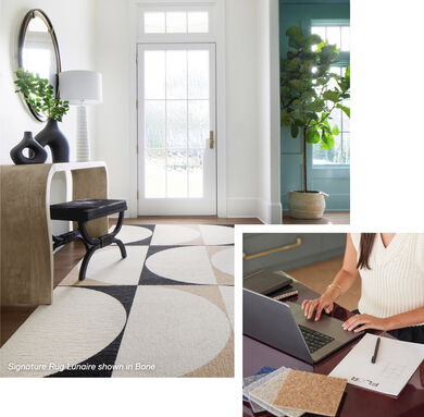
Trying to design the perfect rug?
FLOR Design Consultants are here to help you with your room layout, defining your style, and experimenting with different options. They’re here to bring your vision to life.
The best part? It’s free!
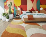
Get ConnectedTrina Turk x FLOR Collection
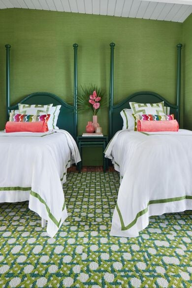
Trina Turk x FLOR Collection
New
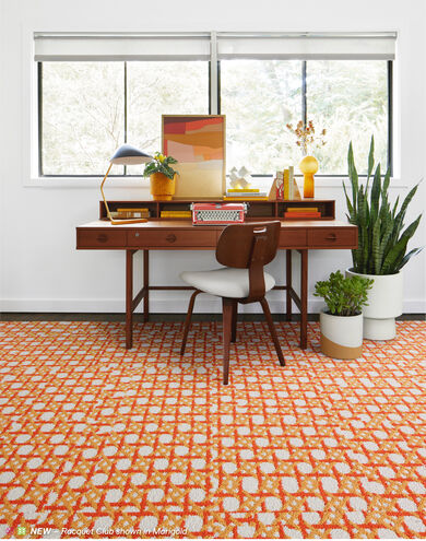
Racquet Club
Tooltip info about Trina Turk icon
 Made with CQuest™

Inspired by a classic cane weaving pattern, this rug is an ace in any room. This is a random pattern and no two carpet tiles are alike. The pattern will not align.
Shop The Style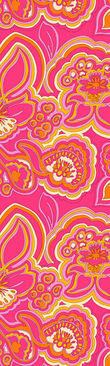
New
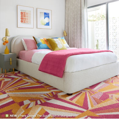
Here Comes The Sun
Tooltip info about Trina Turk icon
Made with CQuest™
Reminiscent of the sun's dazzling rays, this geometric pattern is sure to brighten even the rainiest of days. This is a random pattern and no two carpet tiles are alike. The pattern will not align.
Shop This Look
Go Green with FLOR
Like the yarns used in our rugs, our journey to sustainability is woven into who we are. With thoughtfully sourced materials and a commitment to lower our carbon footprint, our rugs will look beautiful in your home and are good to the Earth.

FLOR partners with Aquafil, who recycles used nylon into beautiful yarns for our area rugs. Aquafil’s regenerated ECONYL® nylon is the same as brand-new nylon but doesn’t utilize new resources.

Our new and improved backing, CQuest™, is made of post-consumer carpet tiles, bio-based elements, and pre-consumer recycled materials that are net carbon negative.
![]() Products with this symbol are made with CQuest™.
Products with this symbol are made with CQuest™.
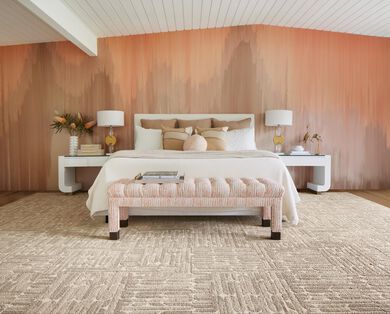
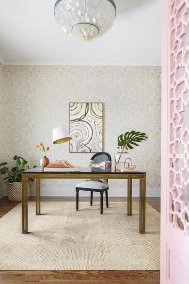
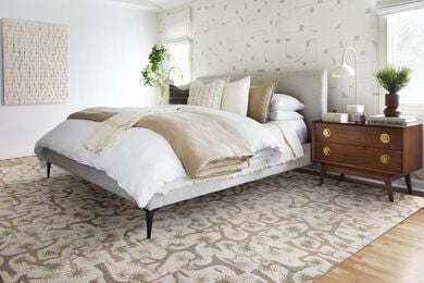
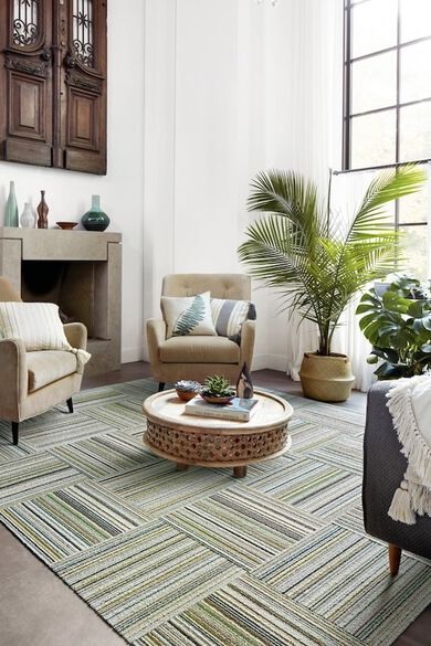
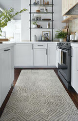
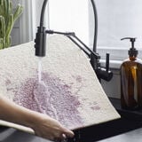
Preserve Your Flooring & Express Your Style With FLOR’s Area Rugs & Carpet Tiles
It’s easy to create the perfect area rug to elevate any room with FLOR’s range of durable and washable carpet tiles. All FLOR modular rug elements can be mixed and matched to create a custom rug in any style or size. And when you’re ready for an upgrade, it’s as easy as swapping out a few carpet tiles for a brand new look.
FLOR also makes it easy to reduce waste with our Return & Recycle program. Just send us your old FLOR carpet tiles using the provided return labels or pre-labeled recycle bags, and we’ll give them new life as brand new carpet tiles and area rugs.
Still not sure which FLOR area rug is the best fit for you?
Explore our curated design categories
Browse our room-specific categories
Estimate the size and cost of your FLOR rug
Experiment with custom designs
- Use our Design Studio
- Work one-on-one with a FLOR Design Consultant
Learn more about installation and care
- How to Install your new FLOR area rug
- How to Take Care of your new FLOR area rug